Posts

"IF THEY WANT POSTCARDS, I MAKE POSTCARDS"

“IF THEY WANT POSTCARDS, I MAKE POSTCARDS”

For the Silent. Silence. Silenced. show at Atlantic Works Gallery, Charlene Liska and I worked together to come up with an attractive and informative post card that would serve multiple purposes:

  1. A Hand-out to give friends and family.
  2. An immediate mailer/invitation. There’s no envelope to open.
  3. A good-looking ‘small flyer’ for us, fellow artist friends, and student volunteers to leave at coffee shops and to pin on announcement boards at museums, cultural organizations, and student centers, etc.
  4. A calling card for when we visit galleries this month.
  5. A possible bookmark and legacy stash.

Front of Charlene Liska’s postcard for Silent. Silence. Silenced.

Decisions to make before designing an Art Exhibit Post Card.

  1. What’s on the Front? Usually an image. Could be words.
  2.  What Goes on the Back? Who-What-When-Where ( more later).
  3. Size. To qualify for First-Class Mail postcard rate the card has to be rectangular, at least 3-1/2 inches high x 5 inches long x 0.007 inch thick and be no more than 4-1/4 inches high x 6 inches long x 0.016 inches thick.
  4.  Print Run. How many to  print?
  5.  Budget. How much money you have to spend on this aspect of promotion//marketing?

As far as print run: we decided to print 500 postcards and print two different front images.  We shared identical print information on the back of the post card and varied the image on the front 250/250.
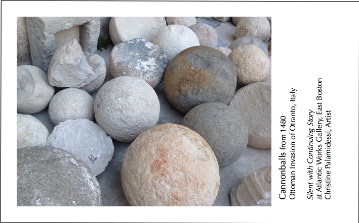
Front of Christine Palamidessi post card for Silent. Silence. Silenced.

Finally, here are the five main points to keep in mind when putting your post card all together:

  1. Plan ahead.  Have the postcards ready 1-2 months before your show opens. This means not only do you need to design the card, but communicate with your printer to find out his/her lead time. So work backwards from your desired date of having the post-card in hand and then line up all the things you need to do to make it happen.
  2.  Who. What. When and Where. Yes, you’ve heard this before and you’ll hear it again. Who (your name) What (name of show and definition of show–is it a pop-up, a month-longshow, a one nighter?)  When (the run date of the show as well as the date of the Opening Night and any other special events during the run of the show) Where (name of the gallery, or venue, and the address. Include zip code and phone number of the gallery and the gallery/venue website. You may consider putting your own phone number on the card, as Charlene and I did,  but realize your phone number may end up on someone’s solicitation list.
  3. Establish Credibility. Be sure to proofread everything. Use high resolution photos/jpg. A sloppy looking card communicates ‘a don’t care/don’t know/I make mistakes attitude’ — which you probably don’t want to do unless that’s the theme of your exhibit, which has its own set of decisions and contradictions not addressed here.
  4. Keep It Clean and Easy. Fewer words are better than a lot of words. People appreciate quick-to-eye grab information. (look at image below–left side of the back of postcard)  to see how we varied caps and lower case, as well as grey and black inks.)
  5.  Ask Friends and Art Community to Help Spread the Word &  Distribute Your Post Cards (drop off, mail, post in their place of work) .


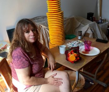
Major Kaye in her Atlantic Works Studio

Major Kaye in her Atlantic Works Studio, September 2016

Atlantic Works Gallery Member 


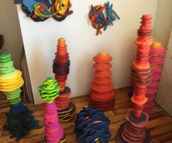
Marjorie Kaye’s sculptures reach out and in and up and beyond. The transcendent stacks of energy are constructed from pieces of plywood, which are cut into shapes with a jig saw, smoothed and then tinted with bold gouache color–or house paint washes. The pieces are assembled in sequences, one piece glued or nailed against the other, forming patterns that transit from basic schematics of color and size into higher, longer and wider dimensions that strive to be freed from the constraints physicality. In her gracious unfolding of form, Kaye considers the mechanics of duality, and the vibration between the laws of intention and those of magnetism.

Perhaps classical in inception, the sculptures are very particular to our present time and reflect the emotions of a meditation on internal space. “I reflect who I am as a person. I bring my inside experience outside,” Kaye says.

Kaye sculptures and paintings have been shown both locally and nationally. She has an BFA in painting and has done graduate work in printmaking. Her work has been reviewed in many publications including the Boston Globe and ArtScope Magazine. She is the founder/member/owner of Galatea Fine Art in Boston, MA, a large artist-run gallery.

In her most recent work Kaye breaks down the emotive qualities of sound, dissecting music, particularly the curvaceous, meticulous and musical chases composed by Bach. She appreciates Bach’s order and expression, pointing out that his arrangements are repetitive and sequential, like her art. “Bach didn’t express chaos. Order allows emotion to come through.”

Kaye grew up in the Boston area, in a musical environment. “It began in the crib–the listening, the appreciating, the dissecting. The family took me to Leonard Bernstein concerts, to musicals.” She remembers seeing, The Carnival of Animals with her grandmother. Kaye sang in oratorios. “In my mid-20s, after art school, I studied voice. But I found I was more interested in music theory than performance. The calibrations. Cadence. The ideas.”

“Yes,” she smiles. “I ride a lot of different horses,”  adding, “when I was young I  started a journey of many disciplines: music, the occult, theosophy, astrology, Judeo-Christian texts, the Kabbala. Eventually it culminated in Zen Buddhism.  And I’m still investigating, contemplating, researching…

“When I think about organized religion, I see no differences. Each is a system to look at the threads that join all of us together.” That thread is apparent in her art. “The most important thing in life is God and spirit. My  art is a spiritual practice; my ongoing contemplation is about the meaning of life. I ask: Who are we? What is nature?

She turned to sculpture as an expressive form when she and her companion, Artist George Shaw, began living together. “George is also a woodworker,” she explains. “There were of scraps of wood around the house. I started shaping the pieces and painting them. Finally I gave myself permission to do sculpture.“

Previously her painting (which she still practices and exhibits) had focused on the mandala. A mandala is a ritual symbol, representing the universe, that guides viewers into a sacred, internal space. “Instead of painting mandalas I began building them,” she says.

Marjorie Kaye's sculptural mandalas

Marjorie Kaye’s sculptural mandalas

In 2016 Marjorie was awarded by the Provincetown Art Association and Museum: a Lillian Orlowsky/ William Freed Foundation grant. “On the application I wrote that with the funding I would get a studio and I did.” In June Kaye moved her tools, paints and wood to  a studio in East Boston, to 80 Border Street, Atlantic Works Studios.

In her studio she doesn’t listen to music. “I like complete silence. Plus I use power tools, and they make a lot of loud noise.” As far as color, the color of her work is bold. “The brighter the better,” she says. Orange seems to be the bridge color. “I use orange to pull everything together. To get from here to there.”

She can’t predict how having a dedicated art studio will effect her work. “For sure I have more opportunity to look and consider each piece,” she says. “But I worked hard in my home studio. I’m just a hard worker; it’s my nature. I’m process oriented. I make the best of any situation.”

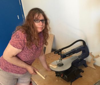
Marjorie Kaye getting ready to use the jigsaw

Marjorie Kaye getting ready to use the jigsaw


MARJORIE KAYE’S ONGOING AND UPCOMING SHOWS:

The Poetics of Space. (with George Shaw) at Atlantic Works Gallery, 80 Border Street, East Boston, MA.  October 8-29, 2016.

Colo Colo Gallery, 29 Centre Street, New Bedford MA. December 2016

FOR MORE VISUALS and info VISIT www.marjoriekayeart.com